An open letter about Charlie Hebdo

January 16, 2015

Dear Comics Internet

I would like to hear all  your opinions about l’affaire Hebdo.

ALL your opinions, every single one.

Comics haven’t been this hot a news item since that time Marvel killed the Human Torch, or maybe when they made Thor into a lady-Thor  — it’s your moment in the spotlight, Comics Internet, so shine like the beautiful star you are.

Your pal,

Jones.

PS: Don’t forget to imply that anyone who disagrees is worse than Hitler, molests children, likes Alex Ross, etc. Above all else: unshakeable certitude in your own sanctimony and the perdition of all others.

Kim Thompson is dead

June 20, 2013

Shit. 56 years old. Too young.

First Thought: Does this mean I’ll see fewer awesome Euro comics from Fantagraphics?

Second Thought: Christ, I’m an entitled arsehole, the guy just died ffs

Third Thought: Actually, isn’t that a sign of how good he was at his job — actually, his calling? RIP, Mr Thompson, one of the all-time greatest advocates that comics has ever seen. Here’s to all the great comics you never had a chance to show us.

Yoohoo sends Dave Sim a sign (UPDATED with mea culpa)

August 25, 2012

This is a real shame: fire has destroyed the negatives for Dave Sim’s High Society digital reprint.

But I have a prediction, and I will gladly bet a zillion dollars on it, at any odds: Sim will interpret this as a sign from God, a sign that…well, something or other. Probably that he shouldn’t be so “hubristic” about the digitisation of Cerebus? (Scare-quotes because I’m imagining Sim interpreting himself that way, not because I think he has been). But maybe that he should stay off the internet? Take up smoking again?

Mark my words, folks.

UPDATE: re-reading the story, I see that this Sandeep fellow has lost everything. That’s really awful. Also, this is bad for Sim, and I genuinely, really, heartfeltedly meant it when I said it was a shame.

This post was an all-time dick move, even though it’s true and was meant as laughter in the face of horror. The first comment here was that I should feel ashamed of myself, and I do. Feel free to submit hate-comments; I’ve surely earned them.

This is why we can’t have nice things

August 5, 2012

This is what happens when you view the entire history of comics through the lens of one very small genre which has, thanks to various accidents of history, become the dominant entry-point for a particular type of reader. You get asinine questions like this, about Floyd Gottfredson’s Mickey Mouse:

One of the things that blew my mind was how those strips feel so much more modern than your average Golden Age super-hero comic, even though they started eight years before Action Comics #1.

That’s right, kids. We’re in a decade that had, inter alia, Prince Valiant, Krazy Kat, Terry and the Pirates, Popeye in Thimble Theatre, Wash Tubbs/Captain Easy, Alley Oop, Dick Tracy, Li’l Abner…and we’re asking why another canon-level comic strip seems modern compared with Action fucking Comics #1.

Comics!

Cartoonists Drawing Like Other Cartoonists #1: Irving does Frazetta

July 10, 2012

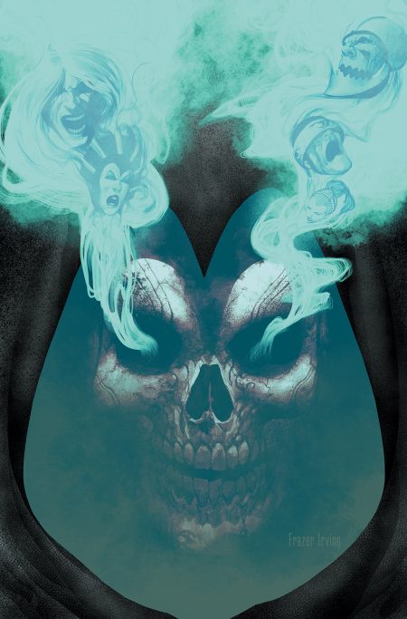
Frazer Irving gets his Frank Frazetta on.

Racism in the Funny Pages, Episode 51,822

June 26, 2012

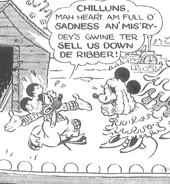
Et tu, Micke?

(detail from Mickey Mouse 10 February 1932, by the great Floyd Gottfredson — even Homer nods ; inks by Al Taliaferro)

Helter Skelter

June 7, 2012

So, it’s now official: I’ve “joined” the Manson family. I have my own bio as a “contributing writer” and everything. Oh, the unspeakable horrors of their initiation rites, how horrible and unspeakable and initiatory they were, what with the rites and the initiations and the horrors, and oh, speak about unspeakable!

Naturally, I’m sworn to secrecy about the exact nature of those rites, but let’s just say the phrase “Now that your Mom’s gone, you have to be the chihuahua” will be forever burned into my memory, as well as my — well, like I said, sworn to secrecy.

Of course, this means I’ll have to step up my douchebaggery to a whole new level. On the CID-Scale (Comics-Internet-Douchebag Scale), writing at HU (even irregularly) ranks only just below posting comments about fuck-Kirby’s-family-what-did-they-ever-create or male-superheroes-are-objectified-too, so it’s time for me to troll up and flame on.

***

Did somebody say troll up and fuck Kirby’s family?

You may have noticed a lot of chatter lately about comic creators getting screwed. It’s just one of those crazy little things that come up every now and then, you know how people love to complain on the internet. Anyhoo, Tom Spurgeon’s been making this kind of point a bit, and I just wanted to elaborate on it a little.

So, consider this. The guy who drove the van that delivered the catering to the site for secondary photography during the postproduction process of the future DVD making-of feature of the popular movie The Walt Disney Company’s Marvel Entertainment’s The Avengers probably made a lot more money out of The Avengers than Jack Kirby ever did.

And that’s no slam on that guy — he probably did a really good job driving that van; if you were in that van you’d probably be all like whoa dude you took that corner so smoothly it was like being tongue-kissed by a lace doily knitted by God Himself. (Ladies, gents, don’t act like you don’t know what I’m talking about). Or even if that guy wasn’t, you know, a veritable William Blake of the catering delivery industry, even if he was just basically what you’d expect — some dude driving a catering van — he probably did an okay job, and he deserves to be fairly recompensed. Let’s send him a nice royalty cheque.

But, you know what?

Let’s send Jack Kirby a much fucking bigger one while we’re at it.

I don’t know, is it partly an American thing? I mean, there are arseholes the world over, but it seems to me, at least in this late stage of capitalism, to be a distinctively American kind of arsehole who will defend to the death the right of Goliath to beat the shit out of David as long as there’s a buck in it and no laws are broken and besides he’s got a goddamn sling why doesn’t he defend himself for Yahweh’s sake?

It makes me wonder: in the world of The Simpsons are there bloggers who pride themselves on being all hard-headed and tough-minded and realistic, able to cut through all the the namby-pamby, sheltered-workshop hand-wringing of the Lennys and Carls of the world? Guys who write long blog posts and message-board comments about how of course it’s perfectly morally acceptable for Mr Burns to build a giant shield to block the sun from falling on Springfield ever again, or to flay the cute widdle puppies of Santa’s Little Helper so he can make a vest out of their skins?

No one put a gun to your head and made you live under Mr Burns’ giant sun-shield. You knew what you were getting yourself in for when you were born in Springfield

Do they write paragraph after paragraph justifying Mr Burns’ decision to dump extremely hazardous toxic waste in the grounds of Springfield Elementary on the rationale that, hey, he’s the one who’s undertaken all the risk of actually putting the waste into barrels and having it driven to the school, so he’s morally entitled to a fair return on his investment? Why do Lenny and Carl hate America? Class warfare! Job-creators! Work-for-hire! Sign the back of this cheque to get paid and thereby validate our legally dubious claims of ownership!

Who am I kidding? Of course there would be people like that.

In the world of The Simpsons, however, the plebs sometimes riot in the face of injustice. Actually, they’ll riot at the drop of a hat, but sometimes it happens to be a hat of injustice, and so they’re kind of rioting in the face of injustice, a face made of hats. Hm, I kind of lost a grip on my metaphors there, but you get my point.

It’s time for a motherfucking riot.
Make Mine Martin: Digital colouring, remastered with extra rambling

May 30, 2012

At Robot6, Brigid Alverson has a short response to my last post, where she offers an elegant explanation of what’s wrong with that kind of colouring: the visual clash between gradients + heavy black lines. (In a comment here, Matt echoes Brigid’s sentiment)

I know essentially zilch about visual theory, but that explanation sounds persuasive to me. In fact, it’s made me think through some of the mainstream artists who have made digital colouring work for them, and many of them use a thin line: Gene Ha, Frank Quitely, John Cassaday — note that these guys often do their own inks, too. And then there’s Frazer Irving and Kyle Baker, who do their own colouring as well, and they often forgo lines altogether when marking colour boundaries.

But Dave Stewart, of course, like his rough contemporary Mark Schulz, worked in that Wally Wood tradition of thick brush inks. So maybe it is as simple as that, that clash between gradients and heavy lines, that explains why Laura Martin’s recolouring looks so goddamn, bloody, I-can-hardly-stand-to-look-at-it, good-god-why, no-seriously-why, not very good.

Funnily enough, until I started reading that IDW reprint volume, I would have called Martin one of the better colourists in the mainstream biz; her frequent collaborations with Cassaday are good stuff. And IDW has delivered a lot of tasteful reprints with no attempts at “improving” the art, so again: what went wrong here? How could people with good taste do this?

It’s such a shame because, come on, the main appeal of The Rocketeer is that art. Does anyone really think to themselves “gee, I really wish I could read about the adventures of some guy with a jetpack, and his gal pal Bettie Page”? …well, okay, some people probably do. But for me, and a lot of others, the drawcard is the art and — while design is a part of that, and that does still shine through the hideous recolouring — it’s even more about Stevens’ linework. And if IDW thought the original colouring was too garish, then hey, they could have released it in black and white…but, you know, in an affordable version.

I just wanted to stare at some nice art — why you gotta play me like that, IDW?

Bring on Fantagraphics’ B/W EC reprints, I say…

One last thought: if Brigid’s right about this style of colouring, is the mismatch something that’s going to persist, or is it just a shift in taste? There was a recent back-and-forth in film blogs about the shift to digital film and how that’s changed the basic “look” of modern cinema. David Bordwell, who’s just released a book about it, represented the old guard by criticising the new look; he quoted Roger Ebert:

Film carries more color and tone gradations than the eye can perceive. It has characteristics such as a nearly imperceptible jiggle that I suspect makes deep areas of my brain more active in interpreting it. Those characteristics somehow make the movie seem to be going on instead of simply existing.

On the other hand you had Jim Emerson, who’s also part of the old guard, being more sceptical about the inherent inferiority of digital:

I love the poetic language Roger and David use to describe the living, breathing, singing qualities of film, but I wonder how much of it is subjective and how much is objective. […] I wonder how much our perceptions are conditioned by our expectations and what we’re used to seeing, rather than the inherent trade-offs between digital and analog formats.

At least about film, I think Emerson’s probably right — relativism about aesthetic properties is way more plausible to me than anti-relativism. But what about comics? In ten, fifteen years time  will the kids who’ve grown up on modern superhero comics prefer this newer, shittier look?

…ha ha, just kidding, everyone knows that no kids whatsoever have grown up on superhero comics since the 90s, except Matt Seneca, and he’s a total freak. So until next time, true believers, make mine Martin!

There really is no accounting for taste

May 23, 2012

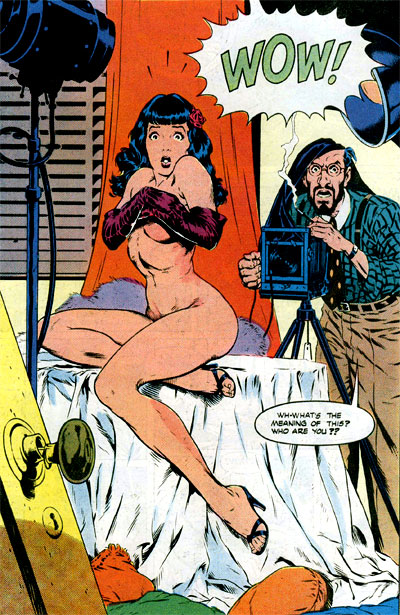
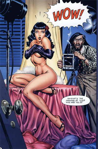
Original version:

Recoloured:

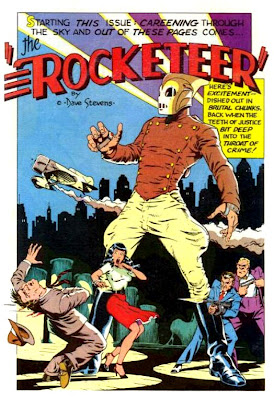
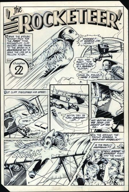
Original version:

Recoloured:
…and so on, for 140 or so pages.

I find it — no exaggeration — genuinely hard to read Laura Martin’s recolouring of Dave Stevens’ Rocketeer, as it appears in the 2011 reprint volume from IDW. I cannot understand how anyone could possibly look at something like this:

and decide that what it needs is a bunch of slick, plastic-looking colour gradients to muddy up Dave Stevens’ linework.

My critical motto has become “different strokes for different folks”, but I look at this reprint and my mind just boggles. The people who published this — and according to the internet, Laura Martin was hand-picked by Stevens himself to recolour the work — thought this was an improvement? Some readers prefer it? Fuck it, any readers prefer it?

Are you shitting me?

Kuhn was right: I literally live in a different world from these people; it is impossible for us to understand one another.

[Images pilfered from: IDW preview art, Chris Sims — one of the readers who, mirabile dictu, actually prefers the recolouring, and Wil Pfiefer]

Modern superhero comics described in one headline

May 14, 2012

General Mills Gives Honey Nut Cheerios Bee Intense Backstory Of Childhood Foster Home Abuse In Bizarre Rebranding Effort