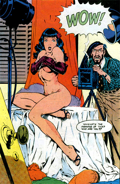
Original version:
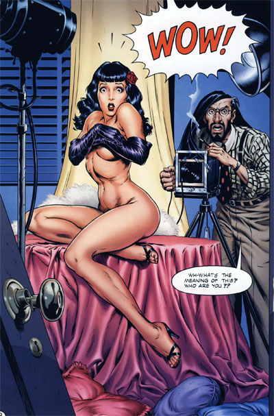
Recoloured:
Original version:
Recoloured:
 …and so on, for 140 or so pages.
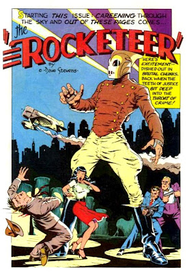
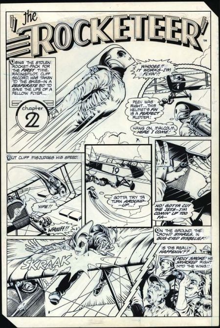
I find it — no exaggeration — genuinely hard to read Laura Martin’s recolouring of Dave Stevens’ Rocketeer, as it appears in the 2011 reprint volume from IDW. I cannot understand how anyone could possibly look at something like this:
and decide that what it needs is a bunch of slick, plastic-looking colour gradients to muddy up Dave Stevens’ linework.
My critical motto has become “different strokes for different folks”, but I look at this reprint and my mind just boggles. The people who published this — and according to the internet, Laura Martin was hand-picked by Stevens himself to recolour the work — thought this was an improvement? Some readers prefer it? Fuck it, any readers prefer it?
Are you shitting me?
Kuhn was right: I literally live in a different world from these people; it is impossible for us to understand one another.
[Images pilfered from: IDW preview art, Chris Sims — one of the readers who, mirabile dictu, actually prefers the recolouring, and Wil Pfiefer]


May 25, 2012 at 10:45 am |
That sort of coloring certainly seems to be in vogue these days. I generally don’t mind it, although it can seem a bit plasticky at times. I don’t get the need to recolor older work like that though. The recent Flex Mentallo collection is a good example; the comparison between the original and new pages is striking in how much energy and vitality was sapped from the art. And any time someone goes back over Jack Kirby art and does that sort of thing makes me sick. They did a Tales of Asgard reprint series a little while back that I could barely bear to look at when I browsed through it on store shelves. It was hideous. A shame, because I would have loved to read those stories. That’s the comics industry for you though: trying to fix old stuff that doesn’t need it, and making new stuff that’s horribly broken.
May 30, 2012 at 4:31 pm |
YES, this issue been in my craw forever. Pure black doesn’t exist in the real world (they rightly say never to use it in painting), thus when it lies adjacent to rounded, more natural, gradient color, there’s a nearly inescapable visual disconnect (like you said, it’s confusing, and the image is almost fighting with itself). Conversely, flat blacks work with more solid color since they’re speaking the same visual language.
It can be done well (if its subtle), but for the most part it’s just off-putting. Especially in the case of recoloring, which is often the most egregious since (as you stated) the art wasn’t even conceived with those values in mind. Plus, why are comic companies using more realistic (read: drab) tones? It’s a comic book, let it be garish and different from the real world.
May 30, 2012 at 8:17 pm |
[…] Let’s you and him fight Look on my works, ye mighty, and despair! « There really is no accounting for taste […]
May 31, 2012 at 12:59 am |
I certainly understand these points and generally agree with them, but if a new generation of readers approaches the work because it looks sleek and “less old,” I guess, then mission accomplished. In this context, the recoloring might just be a gateway to get folks to consider the original draft and hopefully appreciate it, too.
May 31, 2012 at 6:19 am |
[…] one of the Jones Boys, was complaining about the recoloring of Dave Stevens’ The Rocketeer the other day, and looking at the original and recolored art side by side made me realize what I […]
June 2, 2012 at 3:12 pm |
Actually, the thick black holding lines in comics were developed to contain the badly registered color done on massive newsprint runs. So when modern perfectly registered color is applied to that, it most often looks like overkill, even if the colorists don’t do fake airbrushly schlock coloring such as that done by most of the digital technicians nowadays, that would look more appropriate on the sides of vans with Yes and Uriah Heep blasting from the speakers mounted over the waterbed in the back.
June 26, 2012 at 5:16 pm |
I agree with your general point about the potential horrors of recolouring, but I got ‘The Rocketeer: An Album’ (Eclipse, ISBN: 0-913035-06-8) back in the early 90’s at the tender age of 10 or 11 and the “WOW” Betty page is coloured exactly like the recoloured version you mention above. The whole album is coloured in a similar fashion. I fell in love with it as a kid and I still love it now. Each to their own, I guess.
October 2, 2012 at 4:33 pm |
Regardless of how you feel about the recoloring, it was Dave’s choice and there would never have been any new Rocketeer collections if that key stipulation was not met- this includes The Artist Edition. As Laura Martin was and remains one of the top paid colorists in comics, IDW had to pay a pretty hefty tab to have this done.
Astute readers will notice that Laura’s first coloring over Dave’s work was actually published in Brush With Passion at the end of 2008. Dave had originally wanted her to recolor about a dozen images, but she was only able to work two into her schedule. Those two images are the reason she was his first choice for recoloring The Rocketeer.